Tuesday 14 December 2010

Nu Shu


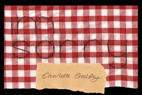
For a project in progress i did this hand rendered type. The quote beside a sister one does not despair is a quote which chinese women would say when talking about their laotong, this was a friendship matchmaked for them. They would share many likes and i think this quote represents there friendship through times where they would have to write nu shu the only communication they had. Nu shu is fastinating as women for a thousand years kept the writing of nu shu a secret, no man had never heard or seen of it until the cutural revolution where most documents were destroyed. Now there is only 1 person who can still write Nu Shu.

Life Drawing


This was from when i was a college about 4 years ago. Been looking through my old work, i enjoying life drawing and playing with different ways to get the weight into an image.

True Hates


This piece is to show my hates in graphic design i guess. A guide to what i will never do. One of these is whenever i walk into a fish and chip shop they all seem to have the same idea that word documents they can cut round the edges of the word to make a sign. Its never a good idea by the way. Also the main hate of many designers comic sans, i dont think i have to say much else its disgusting type face.

Doodle into print


This image was a doodle i did a couple of years ago. With a class at university i turned it into a image on wood used to print unfortunatly most the prints didnt turn out too great but i do love the wood after being used. I think because you can see the texture through the ink.

Social Network


I found this film amazing. Its one of the first films where you are meant to hate the main character. Everything seemed to work prefect from camera work to the cgi of making one guy twins, i didnt even notice had to be informed. The writing was brilliant and acting, which was very surprising from Justin Timberlake. The poster is also a joy to look at. Im not sure what i like about this poster, the type sits in a square which ususally i look down on but the background seems to make the type more strong and visually appealing.